Branding
Product
Client
Dame de Vigne
Agency
Petite Machine
Release date
Location
Provence, France
What I did
Creative Director / Brand Designer
The context
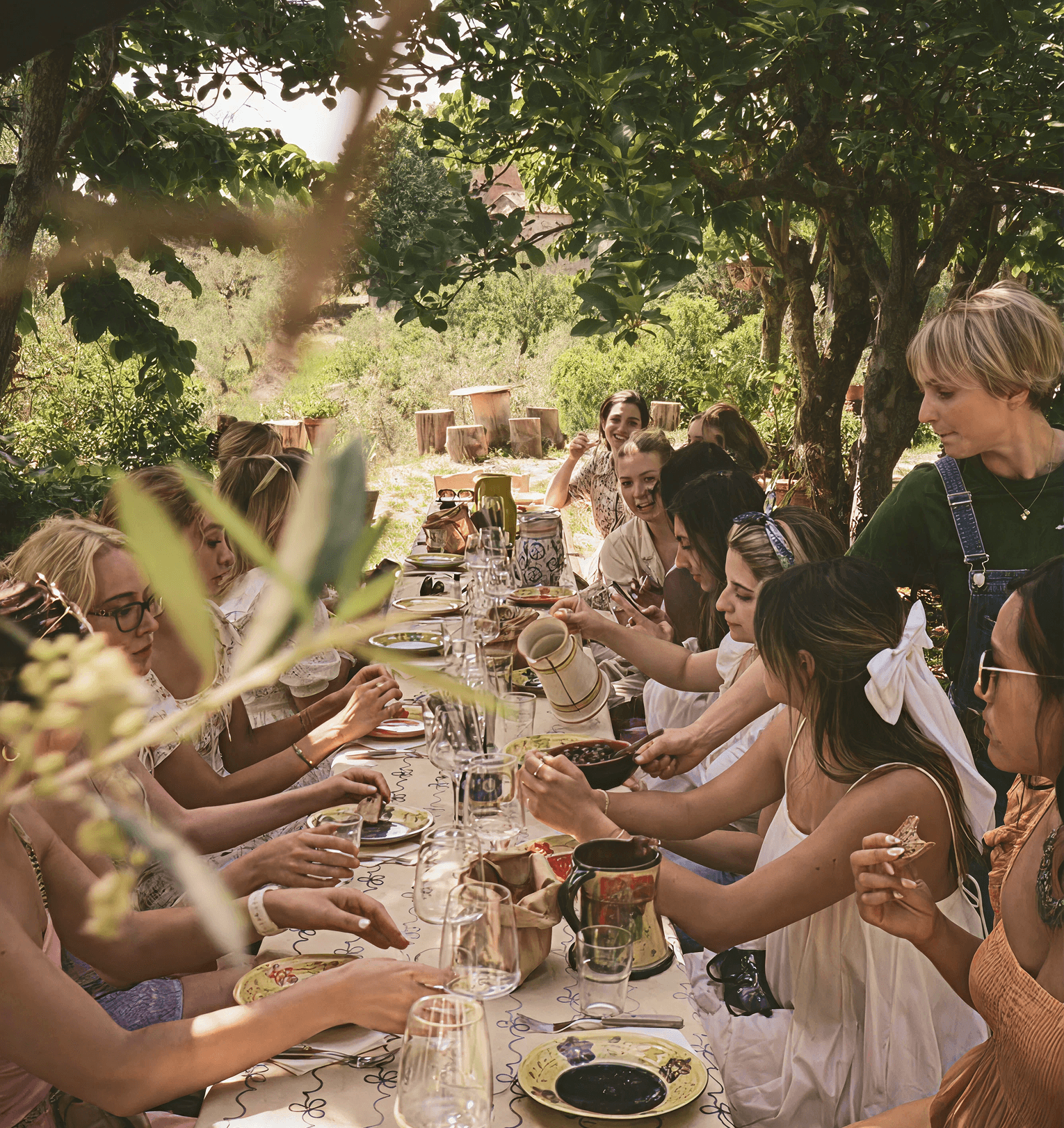
Dame de Vigne is more than a wine label: it’s a way of life shaped by nature, time and human connection. The brand needed a new identity to express its philosophy: authentic, slow-crafted products, a deep respect for the land, and a modern, transparent ethos.
The approach
I designed a visual language that reflects this balance: between elegance and simplicity, earth and light, heritage and reinvention. Inspired by the textures, landscapes and human moments of Provence, the identity was made to be both tactile and timeless. The logomark combines a typographic signature with a vine-leaf loop, grounding the brand in both its name and its values, while a modular system of colour, typography and photography brings flexibility to storytelling, always honouring the truth behind the product: good wine, good local products, shared simply. From the refined logo to the sun-warmed palette, every detail tells the story of a place where things are done with care and shared with joy.
With Dame de Vigne, the brand becomes an invitation to pause, connect and enjoy the real taste of things: a refined yet accessible brand system designed to scale gracefully.


